Ecosurety - Going beyond compliance
Ecosurety are a Bristol-based B Corp, driving positive change in the packaging compliance, waste management and recycling sectors. From start-up roots, they've grown in size and expertise over the past 21 years and needed a new visual identity that better conveyed their maturity.
We partnered on
Brand refresh
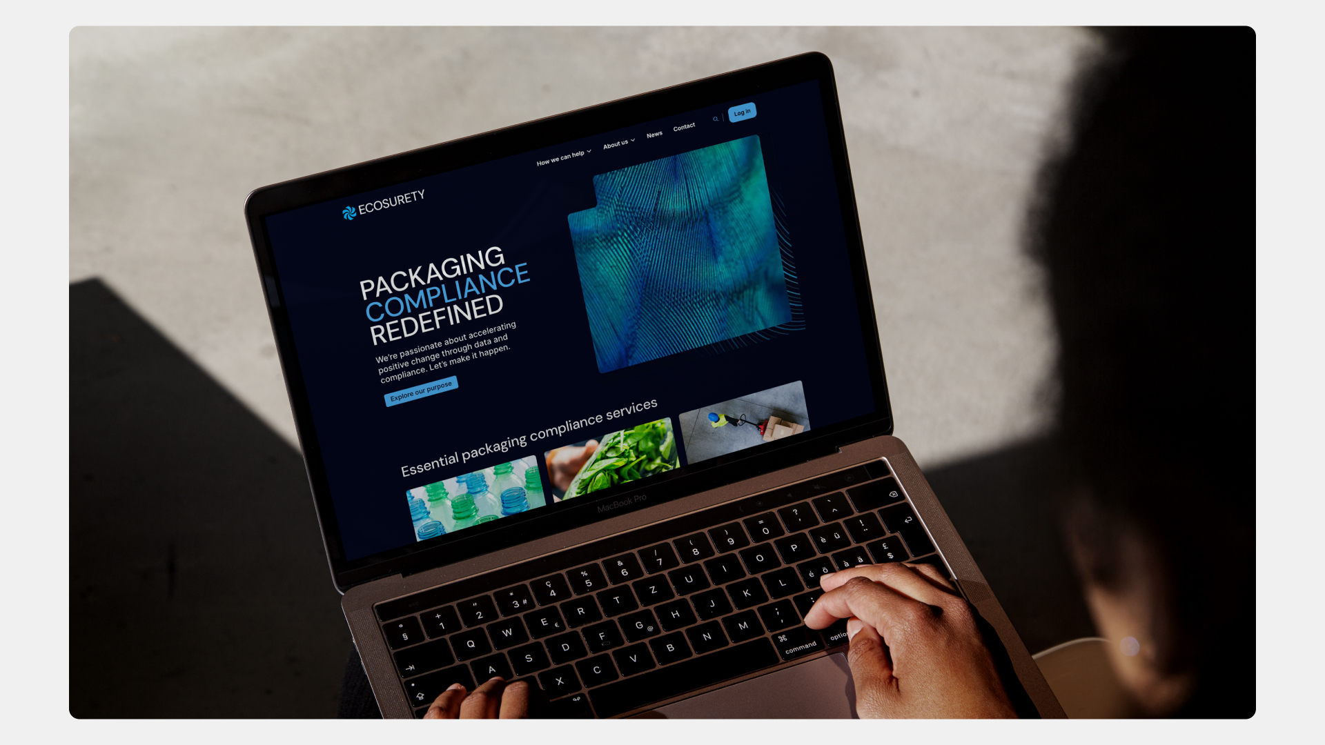
Web design
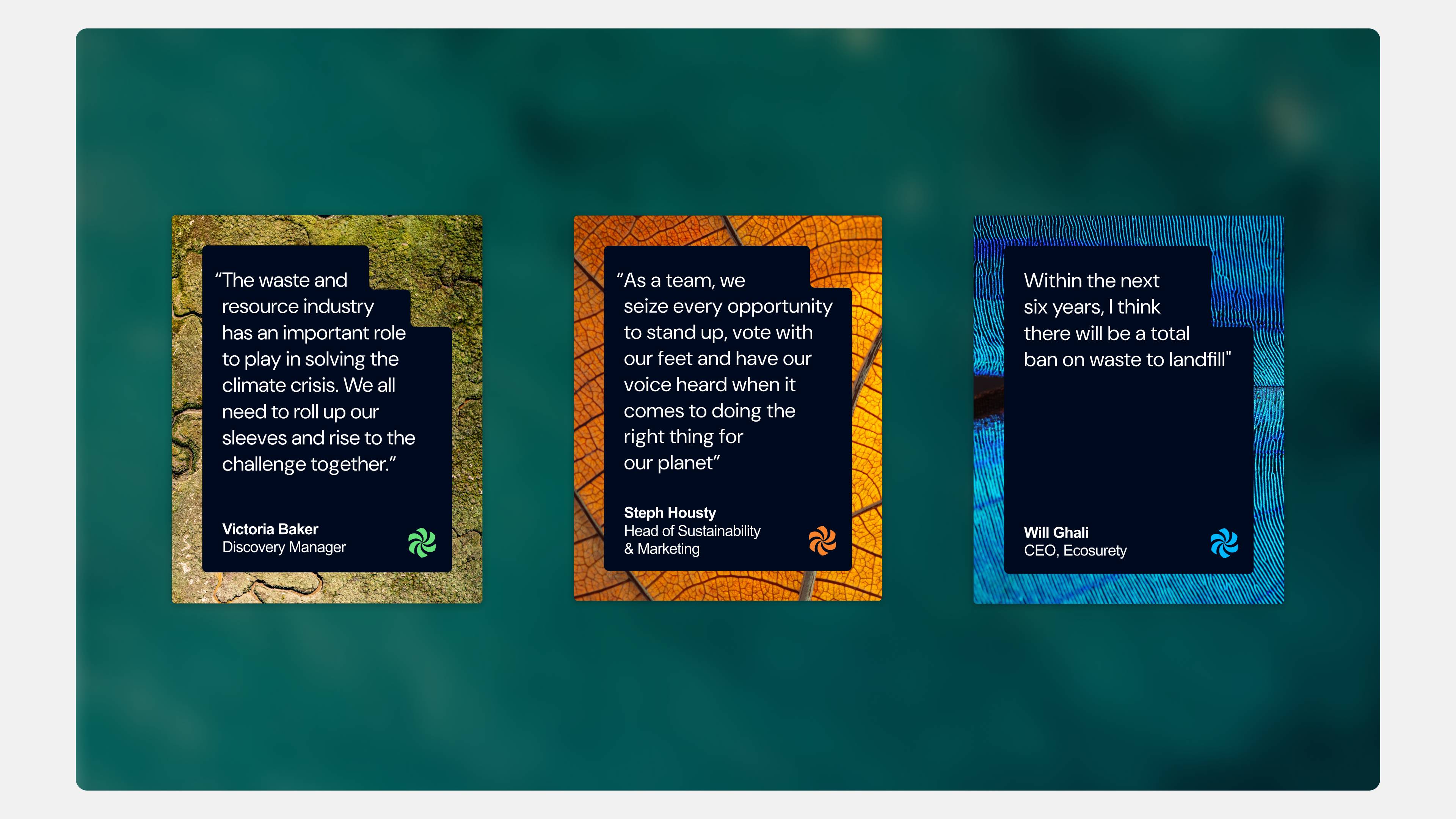
Social Toolkit
Impact Report

It’s been wonderful working with Yoke on our brand’s visual refresh. They took the time to get to know us, our values and how our organisation is evolving.
Louise Shellard - Marketing Communications Specialist, Ecosurety
Challenge:
While no longer fit for purpose, the old Ecosurety brand did have some dynamism - especially in the colour palette - that they wanted carried over into their now refined visual identity. The challenge would be retaining this 'start-up energy', while also conveying a more mature and modern identity.

The team transformed our rough ideas into a creative visual identity that perfectly captured our brand. Communication was clear, and the team was always on hand to support with any questions.
Louise Shellard - Marketing Communications Specialist, Ecosurety

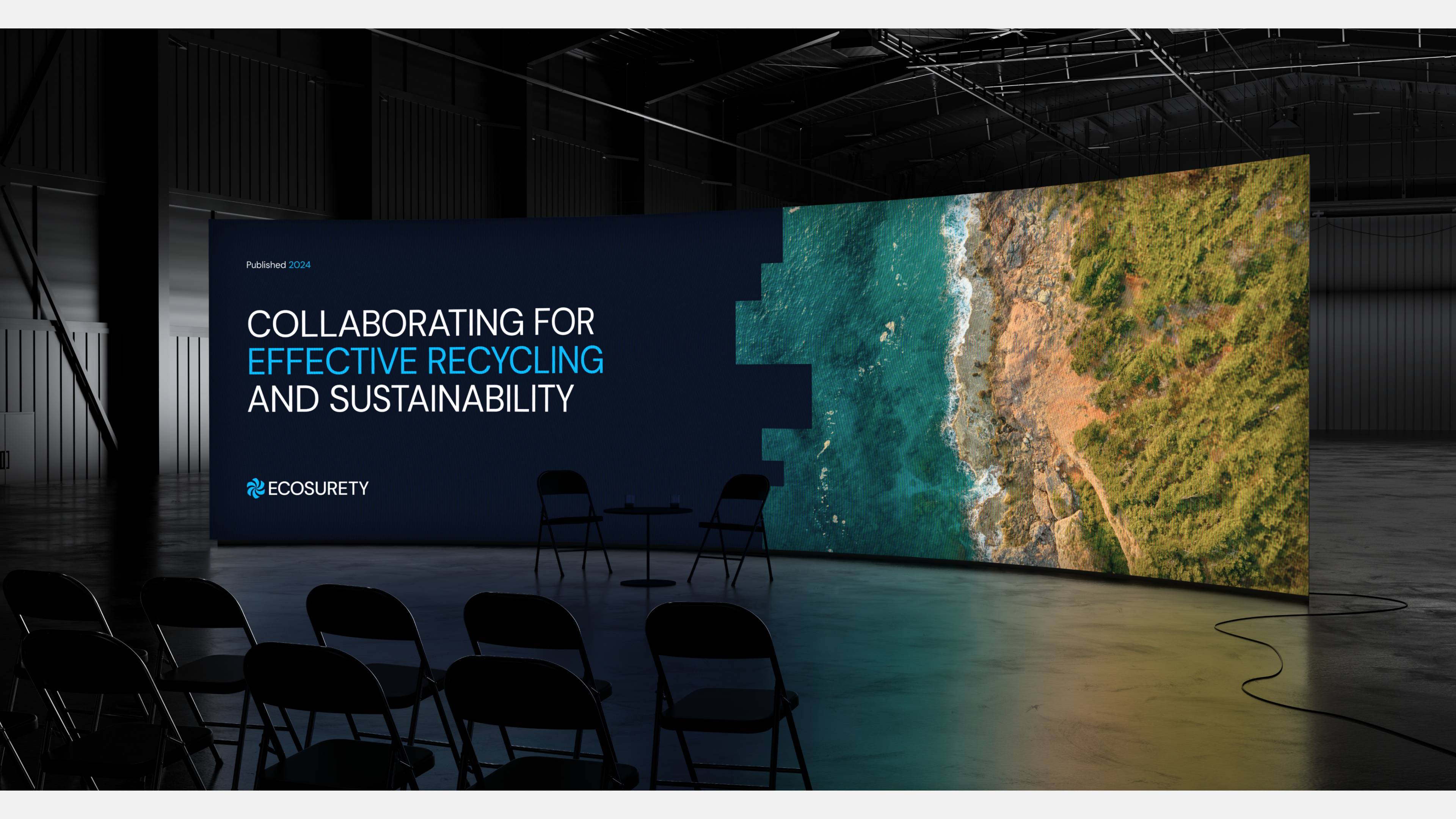
2024/25 Impact Report:
Building on our ongoing partnership with Ecosurety, we collaborated closely to design their 2024/25 impact report, a clear and engaging snapshot of their progress toward reducing unnecessary packaging. The report highlights key priorities like packaging recycling and their Net Zero commitment. Through thoughtful design and accessible storytelling, we helped bring these important stories to life in a way that connects with stakeholders and drives real change. To read more about our approach, check out our blog post.
.jpg)
Solution:
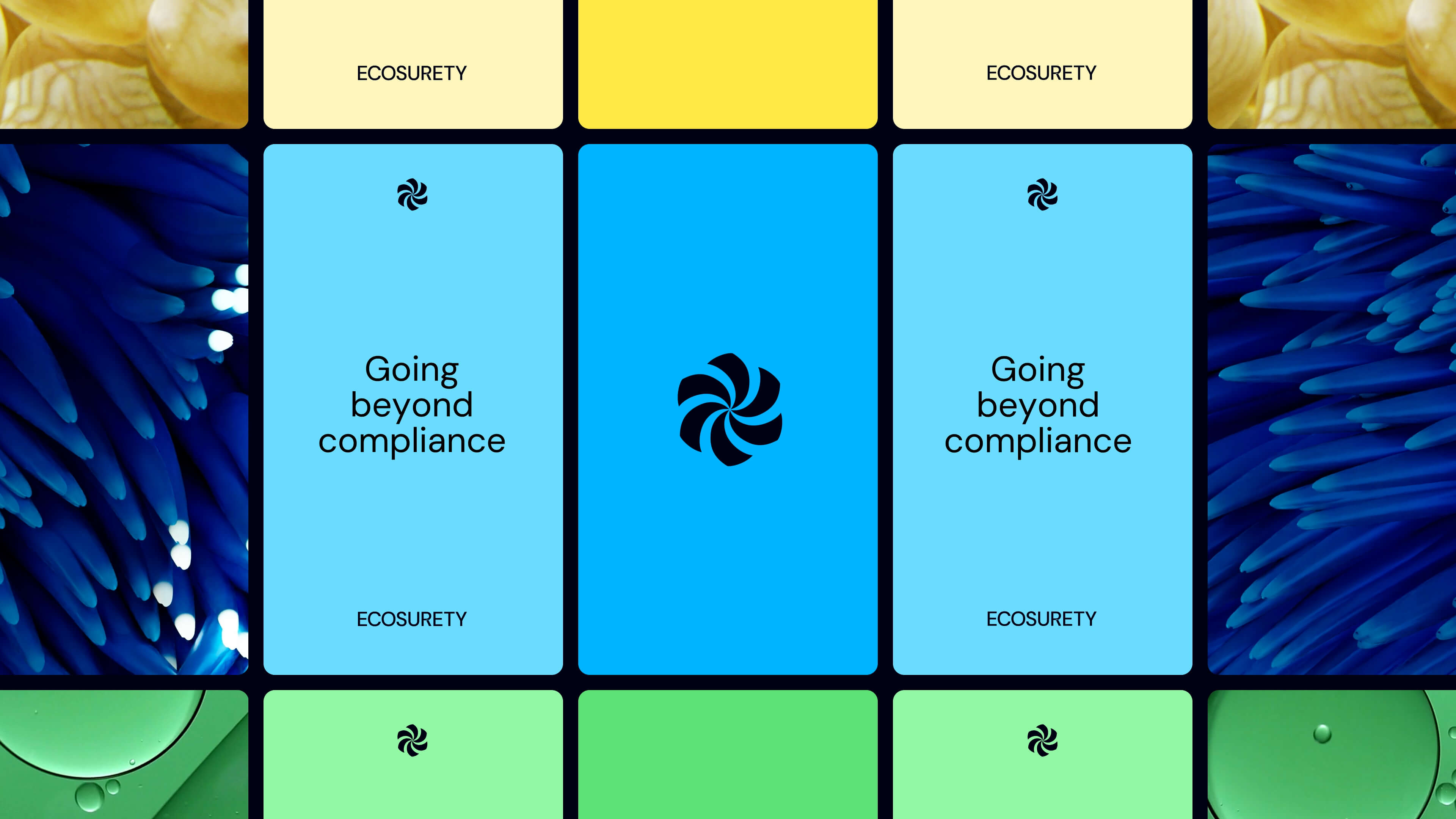
We opted to anchor the new identity in a deep blue that adds gravitas, while conveying a more serious, data-driven foundation. To ensure it wasn't too dark, we then added a range of bright colours that are used sparingly to create fun pops of colour and freshness - preserving the 'disruptor' identity that Ecosurety have been known for. Packaging photos are often repetitive and sterile - so we opted instead for imagery that showed human interaction with packaging. Or macro and aerial images of the landscapes and ecosystems that Ecosurety are striving to help protect.
Seamless Connections
The concept centred around interconnected shapes and forms, designed to seamlessly fit with the others, creating a fluid, harmonious visual experience. By focusing on interconnectedness, we emphasise how individual elements come together to form a complete picture, reflecting Ecosurety's commitment to delivering solutions that are not only functional on their own but also enhance and complement one another. This strategy reinforces the brand’s vision of creating a world where everything fits together effortlessly, fostering a sense of completeness and synergy.
Impact:
This is a big change for the Ecosurety brand, but one that now feels more professional, and much more instep with their own growth and status as a leader in the packaging compliance industry.


Start a project
Embrace the power of design, creativity, sustainability and optimism.
Book a chat with Jay